Get Started With Business Performance Dashboards – Examples & Templates

Table of Contents
1) What Is A Performance Dashboard?
2) Business Performance Dashboard Examples
3) How Do I Make a Performance Dashboard?
4) Performance Dashboards Mistakes to Avoid
To succeed in today’s competitive commercial world, the ability to make the right decisions at the right time based on water-tight insights is essential. If you don’t have the vision or don’t know what to do with it, you’ll find yourself shooting in the dark – and that is detrimental to the growth and evolution of any business, regardless of size or sector.
That said, if you’re looking to evolve your empire, increase brand awareness, and boost your bottom line, embracing business performance dashboards and big data should be at the top of your priority list. And we’re not just talking about a single function, but all your business’ bits and pieces should embrace the power of modern data analysis and utilize a professional dashboard creator that will enhance your data management processes.
Intrigued? Excellent – here, we will explore the link between big data and organizational efficiency while looking at a dynamic mix of real-life performance dashboard examples and explain why you need one (or several). But first, let’s look at a definition.
What Is a Performance Dashboard in Business?
A performance dashboard is a powerful visual analytics tool that offers robust knowledge of different business strategies. They enable users to drill down deeper into their performance in a number of areas while developing targeted strategies for continual growth.
A product performance dashboard offers a wide range of info in one central location, allowing organizations to drill down into important product KPIs without the need to log in to separate tools or platforms but only a single dashboard software. It helps to easily spot the overall efficiency of product lines and adjust the quality, development of new products, and evaluate existing ones.
Business tools like this one assist in the cohesive rather than fragmented analysis of critical datasets, which ultimately results in sustainable commercial success in a competitive digital landscape.
The vast majority of business dashboards offer a customizable interface, and a host of interactive features, and empower the user to extract real-time data from a broad spectrum of sources. This level of functionality presents a significant advantage over static reports, making these dashboards a key component to improved business intelligence (BI).
Try our professional dashboard software for 14 days, completely free!
Business Performance Dashboard Examples
Another notable benefit of visual analytics tools is their self-service nature. Accessible, intuitive, and easy to navigate, it’s possible to use these invaluable online BI tools to their fullest potential without the need to rely on developers or technical staff.
In addition to this, a dashboard for business performance also builds confidence. The detailed, accurate, and digestible insights served up by modern dashboards give senior staff or personnel conviction when making decisions, which, in turn, will drive staff engagement while boosting success in a number of key organizational areas.
When you start working with these types of tools, you will achieve true organizational business intelligence (BI), boosting your commercial progress (as well as profits) in the process.
To put this idea into practical perspective, here is a mix of dynamic performance dashboard examples related to a range of different organizational departments, functions, or processes for your viewing pleasure. Let’s start with marketing.
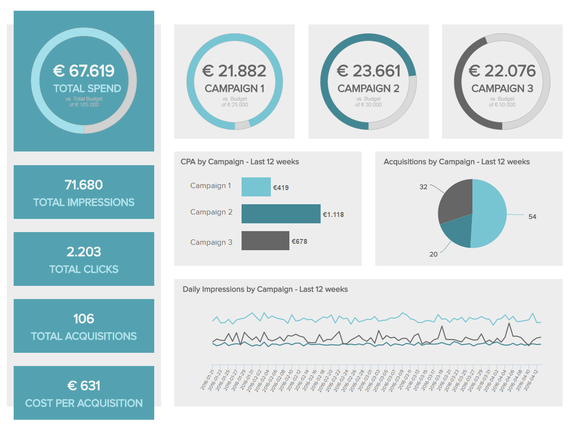
1. Marketing Performance Dashboard
One of our pivotal marketing examples, this template has proved to be the beating heart of many successful organizations.
**click to enlarge**
Offering a comprehensive level of insight into critical marketing results data across a multitude of marketing channels and campaigns, this powerful tool will help you to create detailed marketing reports, and enjoy a maximum ROI for every one of your business’s promotional efforts. You can clearly see the general overview followed by the specific value of each campaign you have launched. By gaining this wealth of knowledge in a clear and feasible way you can easily spot which campaign is the best performing one, and which channels have the lowest cost-per-acquisition, and enable you to think about what steps you can take in your future promotional activities.
By delving into vital benchmarking KPIs including click-through rates, cost-per-click, and cost-per-acquisition, this priceless data dashboard will give you a greater understanding of the costs of your marketing efforts in comparison to your actual costs. Plus, metrics like click-through rate will also help you gauge how engaging or effective specific marketing initiatives are, allowing you to make the tweaks necessary for optimal promotional success.
Primary metrics:
- Click-Through-Rate (CTR)
- Cost-per-Click (CPC)
- Cost-per-Acquisition (CPA)
For more intel on these business performance template examples, explore our full range of marketing dashboards.
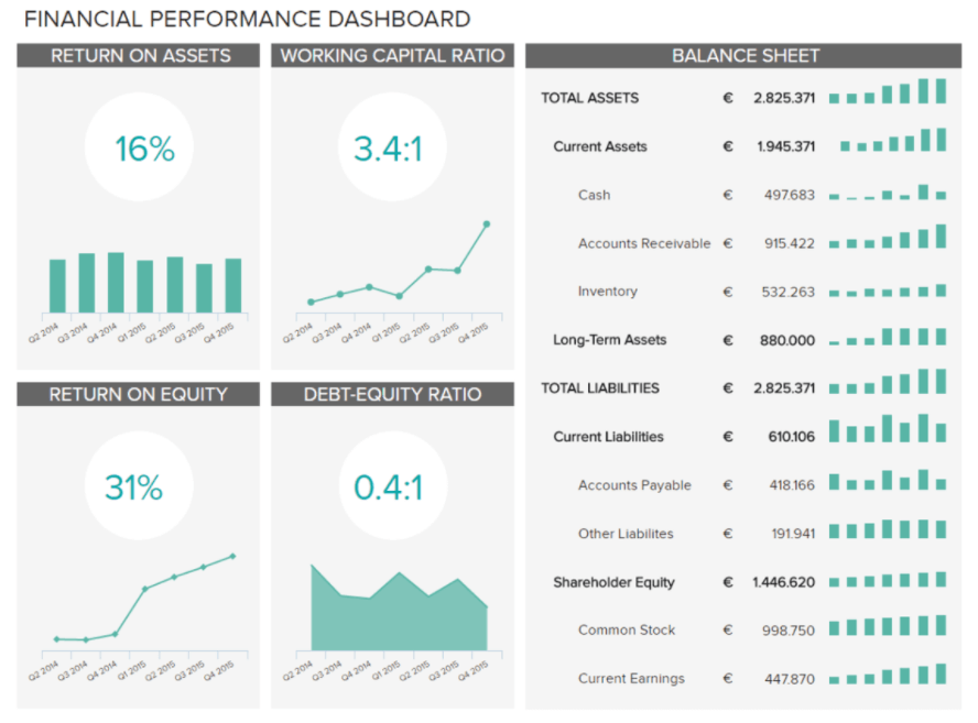
2. Financial Performance Dashboard
The finance department of any organization, regardless of industry or sector, is vital to sustainable success and economic fluidity. This financial report example offers a robust snapshot of your company’s capital structure in addition to how your existing assets are being managed.
**click to enlarge**
This essential template closely monitors the two ratios (return on assets and return on equity) that will ensure you maintain control of your organization’s financial health on a continual basis, which, in turn, will not only help the company thrive but also give it the ability to deal with unexpected roadblocks or issues in a professional, productive manner.
The financial graphs depicted above prove how simply you can visualize all your company’s growth that is focused on capital and a general overview of the balance sheet. By closely inspecting these crucial financial indicators, you can immediately understand how your company’s assets are managed and adjust your strategies accordingly if needed.
Primary metrics:
- Return on Assets
- Return on Equity
For more examples like this one, explore our full range of financial dashboards.
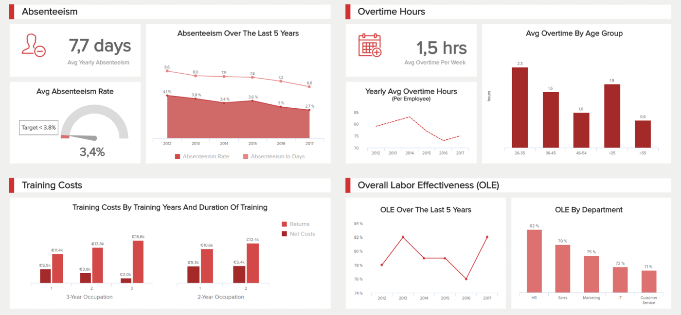
3. Employee Performance Dashboard
It goes without saying (almost): your employees are the very people that make your organization tick, which means monitoring success and consistency in this area is critical to your ongoing commercial success. And this most valuable of business performance dashboard templates will help you manage your staff the right way.
**click to enlarge**
Our HR example concentrated on employee performance offers a host of information on key areas including attendance, productivity, overtime, training costs, and other critical areas in HR analytics. By gaining a deeper level of insight into these aspects of your employee’s performance, you will be able to spot trends, identify inefficiencies, and increase engagement where it might flounder. For example, you can indicate the level of motivation and engagement of your workers based on the absenteeism rate, and follow the numbers over the course of 5 years, as presented above. Additionally, you can measure employees’ productivity levels and tailor this indicator to your specific needs such as letting people set their own working hours that will help them be as productive as possible.
With this online dashboard, you will gain the power to motivate and inspire your employees, provide training support in the right areas of the business, boost morale, drive down operational costs, and make strategic choices that will benefit both you and the people working within your organization.
Primary metrics:
- Absenteeism Rate
- Overtime Hours
- Training Costs
- Employee Productivity
For more on this topic, explore our full range of HR dashboard examples.
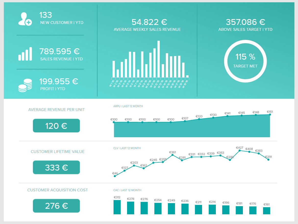
4. Sales Performance Dashboard
Focusing on sales growth and profitability, this example provides a panoramic overview of the sales department’s progress by drilling down deep into sales KPIs such as sales targets, ARPU (average revenue per unit), CAC (customer acquisition cost), and CLV (customer lifetime value).
**click to enlarge**
One of our most valuable performance dashboard templates, this is essentially a one-stop shop for sales insights that will help you iron out inefficiencies, enhance the productivity of your sales team, and boost your profitability on a sustainable basis.
The goal here is to increase customer lifetime value and average revenue per unit or user/account while driving down acquisition costs – and the indicators served up here will help you meet these goals and maintain them over time. This example shows how the performance of the sales department can be viewed through a strong pipeline created with simple sales charts. Whether you need to monitor progress on a weekly or strategic level, this kind of representation of data will ensure you stay focused on your most important KPIs, as mentioned. Moreover, you will visually see what happens and what can happen when you start interacting with your online data visualization creation that will, ultimately, secure top departmental performance.
Primary metrics:
- Sales Growth
- Sales Target
- ARPU
- Acquisition Cost
- CLV
For more examples like this one, explore our full range of sales dashboards.
5. Support Team Performance Dashboard
Another crucial part of a successful company is the support team. That’s why a complete Zendesk dashboard will provide you with invaluable data on your team’s progress and give you instant insights and ideas on how to improve.
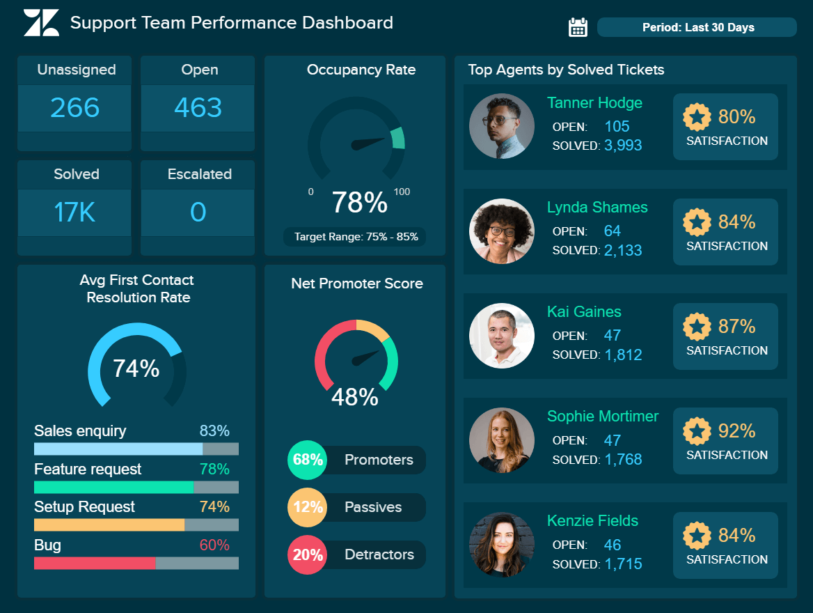
**click to enlarge**
KPIs such as the net promoter score, first contact resolution rate, occupancy rate, and top agents will ensure you monitor, visualize and analyze your performance in all relevant aspects of support operations that will improve your bottom line.
It is not a secret that customer service is the face of the company that needs to have top-notch capabilities to be able to deliver results and ensure efficiency in utilizing call center KPIs that will, ultimately, increase profits. We can see in our example the first contact resolution rate that needs to be closely monitored alongside the average resolution and occupancy rate to see how they correlate and influence customer satisfaction. On the right side, we can see the top-performing agents, an important indicator to see how your employees perform regarding the ticket status. When you identify these agents, you can also ask for additional education for each member of your department to see how to improve and implement their knowledge.
Primary metrics:
- Top Agents
- First Contact Resolution Rate
- Utilization Rate
- Net Promoter Score
6. Healthcare Performance Dashboard
Improving the clinical and financial performance of a hospital is one of the top priorities in this important industry. Depicting crucial KPIs such as the average length of stay, average nurse per patient ratio, and treatment costs will enable you to take full control of your hospital’s overall efficiency and ensure you can offer the best possible care to current and potential patients.
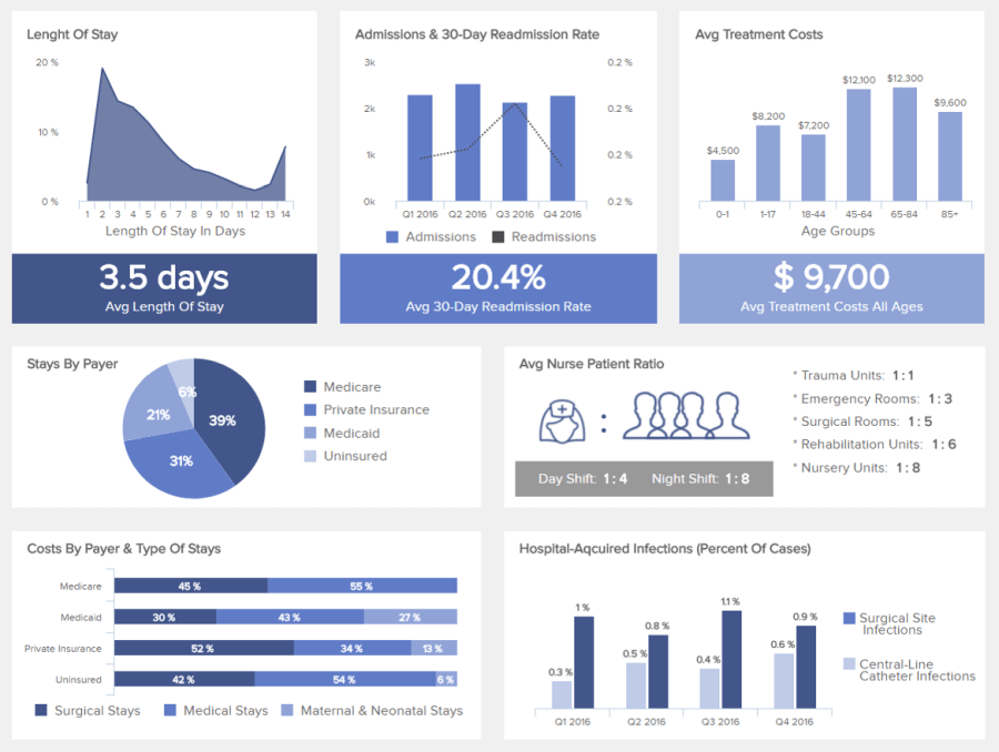
**click to enlarge**
By utilizing healthcare analytics software where you can set your KPIs and create powerful visuals, you can optimize your operations and increase the productivity of your hospital. Your patients and staff are the most important part of succeeding in the healthcare industry. You need to keep an optimal number of available staff to take care of patients and make sure you don’t overburden your employees. That way, your hospital won’t face issues in providing the best possible care. Smart alarms and automated reports provided with this analytical tool will ensure smooth operational processes and effective hospital management. Besides, you can utilize ad hoc analysis and create reports based on standalone questions and adjust your dashboards accordingly.
By combining all these metrics, you will be able to monitor each important aspect of your hospital and generate insights instantaneously while keeping a close eye on finances, the overall workload of your staff, and patients’ satisfaction levels.
Primary metrics:
- Average Hospital Stay
- Hospital Readmission Rates
- Costs By Payer
7. Transportation Dashboard
In an age where consumers are more demanding than ever, optimizing your transportation processes and initiatives is essential.

**click to enlarge**
Ensuring that every aspect of the transportation chain is cohesive is vital to maintaining an optimal level of service while eliminating unnecessary costs and logistical roadblocks. And while this may seem like an impossible feat, it is more than possible in the digital age.
This tool is designed to improve delivery times while driving down transportation costs. Our cutting-edge logistics dashboard offers a clear-cut snapshot of destinations, delivery status, and loading times.
This perfect storm of visual insights is a prime example of a dashboard to measure performance in business and will help busy logistics managers make informed decisions at a glance while creating strategies that will ultimately improve core service levels.
This is an essential template for any goods-based organization, big or small.
Primary metrics:
- Delivery Time
- Transportation Costs
8. Sales & Order Overview Dashboard
A powerful retail-based monitoring dashboard, our sales and orders template is a logical and visually balanced informational nerve center built to consistently improve.
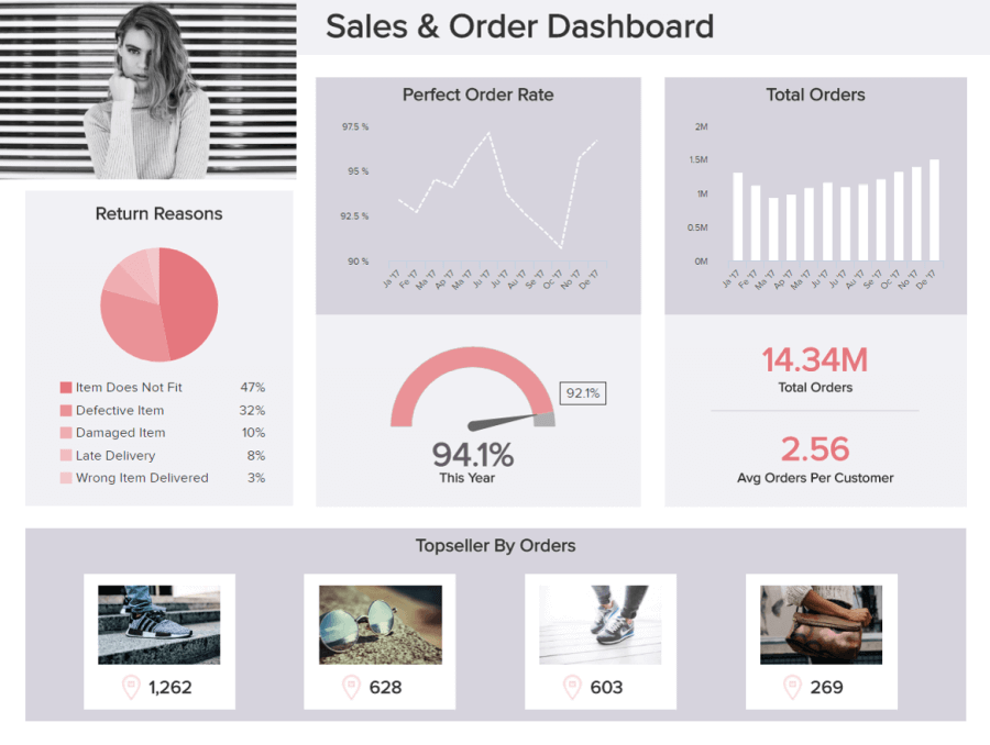
**click to enlarge**
When it comes to sales and orders, consistency and strategy are key – and that’s exactly what this performance management dashboard delivers. Here, you benefit from essential retail insights surrounding order return reasons, perfect order rates, overall order number, best-sellers, regional sales, and a wealth of additional info in one central location.
This fluid mix of retail-based dashboard performance KPIs offers decision-makers the tools required to spot potential weaknesses, identify strengths, and make strategic moves that increase efficiency while driving down order returns and increasing sales. For example, if you notice in a retail KPI significant deviations or the same return reasons over and over, it makes sense to adjust your strategies accordingly and listen to what your customers have to say.
This is a product analysis template that is insightful, actionable, and – if you’re a retail or eCommerce-based brand – accelerates your success in a competitive commercial landscape.
Primary metrics:
- Total Orders
- Total Sales by Region
- Order Status
- Perfect Order Rate
- Return Reason
9. Facebook Page Dashboard
Next in our rundown of dynamic performance dashboard examples is our Facebook dashboard.
With over 2.7 billion monthly users worldwide, Facebook is still one of the planet’s most popular social media platforms. Regardless of your niche or sector, as a company in the digital age, knowing how to utilize the platform to your advantage will accelerate your commercial growth significantly.

**click to enlarge**
One of our most visually striking templates, this particular innovation offers a wealth of insight into Facebook’s most valuable metrics – information based on engagement, demographics, and regional interest.
By gaining access to this treasure trove of company metrics, you can gain a working understanding of the type of content that resonates most with your audience based on demographics, posting time, and region.
Armed with these visual Facebook metrics, senior decision-makers, and social media marketers can utilize this performance monitoring dashboard to drive engagement while enjoying a maximum return on investment (ROI) from Facebook-based activities.
This is a performance review dashboard that will prove invaluable to every modern organization looking to make its mark and use it as an invaluable social media report template.
Primary metrics:
- Number of Fans
- Follower Demographics
- Page Views by Sources
- Actions on Page
10. Profit & Loss Dashboard
Our next example hones in two essential financially-based functions: profit and loss.
By understanding and gaining insight into the trends or factors driving your profit and loss, you can improve your company's financial health and growth significantly. That’s exactly what this most vital of reports does.
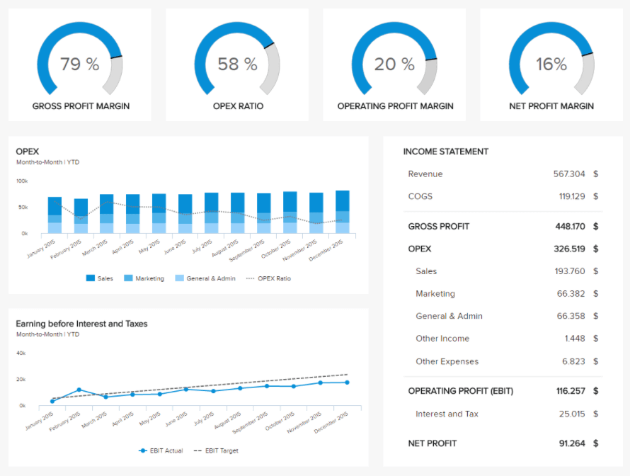
**click to enlarge**
Working with a balanced mix of performance dashboard metrics, this dynamic BI finance tool provides a clear-cut rundown of monthly progress as well as financial aspects, including gross profit margin, opex ratio, operating margin percentage, and net profit margin percentage. This perfect storm of profit and loss insights will empower key decision-makers to make accurate financial projections, nip any possible inefficiencies in the bud, and create an ongoing sense of fiscal balance.
The well-crafted charts featured within this performance management dashboard empower users to make direct financial comparisons to previous months or years while pinpointing the precise factors that will aid ongoing growth across the business, making budgets go further while boosting income where it counts.
By working with these visualizations regularly, you will ensure you’re not just meeting but exceeding your core financial goals while boosting your bottom line year after year - the key ingredients to commercial growth, evolution, and success.
Primary metrics:
- Gross Profit Margin Percentage
- Operating Profit Margin Percentage
- Operating Expense Ratio
- Net Profit Margin Percentage
Try our professional dashboard software for 14 days, completely free!
11. Google Analytics Performance Dashboard
Google Analytics (GA) is one of the world’s most powerful, popular, and accessible data-driven platforms. If you’re not using GA, you should be. And working with the right tools to track performance will help you squeeze extra value from this platform.

**click to enlarge**
This example is one of the most powerful Google Analytics templates out there as it provides an extra layer of insight that will not only empower you to tweak your GA strategy for the better but also deliver exactly what you need to succeed in an increasingly cutthroat digital age.
Slick and designed to offer a wealth of quickfire insights, this is one of our most potent performance dashboard examples. This is because when you’re armed with access to the right depth of insight at-a-glance, you will be able to make the right decisions faster, pushing yourself ahead of the competition.
Here, you can engage with invaluable Google Analytics KPIs, including goal conversion insights and completions by country (among many others), which will give you the power to meet the needs of your international customer base head-on while enjoying a maximum return on investment (ROI) from all promotional communications and activities.
Primary metrics:
- Sessions and Users
- New and Returning Visitors
- Bounce Rate
- Goal Conversion Rate
12. Content Quality Control Dashboard
We are still living in a time when content reigns supreme. Studies show that B2B companies with a consistent blog presence earn 67% more monthly leads than brands that don't.
By delivering a consistent flow of content that offers your audience real guidance, value, and inspiration, you will earn more sales, grow your customer base, improve your customer retention rates, and boost your search engine authority.

**click to enlarge**
Our powerful content quality control example will ensure that every single piece of content you produce and publish makes as much impact as possible, significantly improving your marketing campaigns in the process.
One of the most useful templates you could have at your disposal, this content-centric informational hub features a Flesch Reading Test rundown to ensure people find your communications engaging and understandable.
In addition to benchmarking the readability of your content, you can also drill down into the impact of particular pieces of content based on engagement (comments per article), subscribers acquired, and top-performing articles. Everything you need to optimize your content marketing strategy for consistent success all in one place.
Primary metrics:
- Flesch Reading Ease
- Average Comments per Article
- Story Turnaround Time
13. Zendesk Talk Dashboard
As one of the planet’s most extensive customer service-based CRM innovations, Zendesk will help you optimize your consumer-facing activities regardless of your business’s niche or industry.
If you want to extract a wealth of extra panoramic consumer insights and get ahead of the competition, using our Zendesk dashboard is key.

**click to enlarge**
Closely linked to a sales performance dashboard and employee performance dashboard, our Zendesk talk visualization tool focuses on the frontline of consumer communications, monitoring every key aspect of talk time.
By working with a cohesive mix of tables, charts, and graphs, it’s possible to monitor your agents’ ongoing call performance, offering training, support, or rewards where necessary while looking at call efficiency, quality rates, and unsuccessful communications through a microscope.
By gaining access to this wealth of deep-dive visual data, you can make better real-time decisions while creating initiatives to significantly improve your overall verbal comms strategy, attend to your customers with complete consistency, and, of course, grow your audience.
Customer service is one of the key pillars of any solid organizational strategy. Especially during a time when consumers can connect with businesses through an ever-growing mix of channels, getting your talk communications right is essential.
Primary metrics:
- Answer Time
- Leg Talk Time
- Unsuccessful Inbound Calls
- Quality Rate
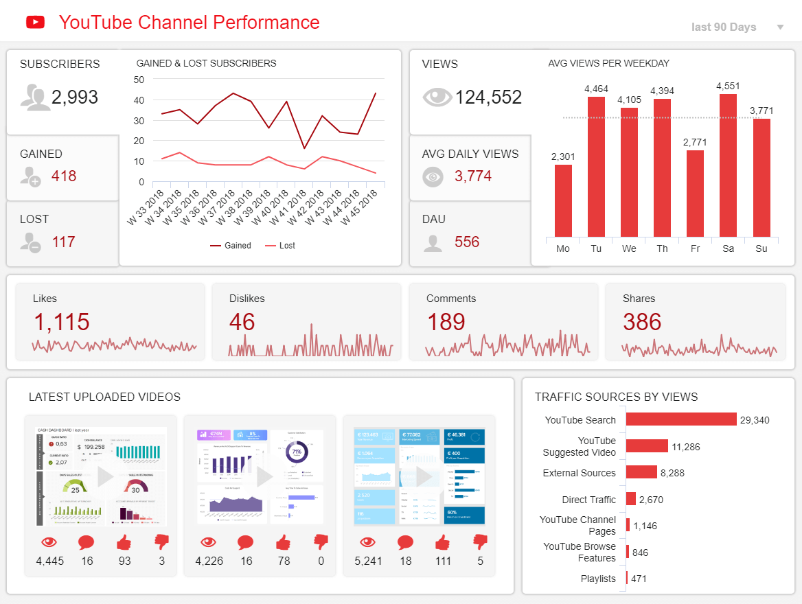
14. YouTube Channel Performance Dashboard
Visual information is more digestible to the human eye than any other form of content. This explains why video is such a popular promotional medium in this day and age.
With two billion active users worldwide, YouTube is a prime marketing and communications tool for just about every kind of company imaginable - yours is no exception.
**click to enlarge**
A visually balanced analytics platform that exists to accelerate YouTube channel growth while increasing engagement and attracting a wider audience to your video content, our YouTube channel dashboard is equipped with the tools to help you track your subscriptions numbers, quantify your daily active users, and understand your key referral or traffic sources.
By knowing which pieces of video content resonate with your audience and which don’t, you will gain the direction you need to develop ideas that offer maximum ROI. And by digging deeper into your channel’s subscriber rates over time, you will gain the knowledge required to tackle any inefficiencies in user engagement, getting the very best from your YouTube-focused activities as a result.
Your YouTube performance often has a direct impact on the success of your content marketing strategy, so working with these performance metrics is incredibly important. Use them to your advantage, and you will reap long-term commercial rewards.
Primary metrics:
- Number of Subscribers
- Daily Active Users (DAU)
- Traffic Source
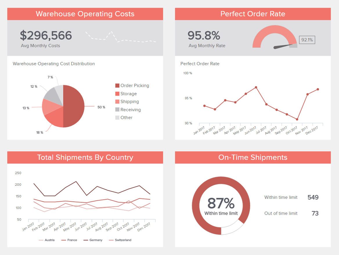
15. Warehouse Performance Dashboard
If you have a company that deals with intangible goods, the efficiency of your warehouse will have a significant impact on the ongoing efficiency and productivity of your organization.
**click to enlarge**
While shooting in the dark and hoping for the best used to be standard practice concerning warehouse logistics, without an analytical approach to your activities, you will never meet your full potential (and a potential business-damaging calamity will always be lurking around the corner).
This insightful logistics example is arguably one of our most practical performance management dashboard examples, as it provides a panoramic snapshot of warehouse expenditure, shipment quantities, order accuracy, and on-time shipments.
Armed with all of this visual data in one place, warehouse managers can deal with potential supply chain snags in real-time while reducing unnecessary outgoings, improving in-house logistics, and scaling your fulfillment capabilities with fluidity.
Anything can go wrong at any given time in a warehouse situation, but by using this fully interactive dashboard, you can mitigate any problems confidently and accurately. And, as a warehouse decision-maker, the ability to think on your feet, backed by razor-sharp logistical data, will help you surpass your goals on a regular basis.
Primary metrics:
- On-Time Shipping
- Order Accuracy
- Warehousing Costs
- Number of Shipments
16. Investment Performance Dashboard
As a company owner or decision-maker, measuring your investment progress and potential with pinpoint accuracy is essential. Without showcasing the right facts, figures, patterns, and trends, it’s unlikely that you’ll attract the right backing in the long run. That’s where our investment performance dashboard comes in.

**click to enlarge**
With a balanced grid-like design and a wealth of accessible visual insights, this powerful tracking tool serves up persuasive metrics based on your P/E ratio, return on assets, and return on equity. This melting pot of fiscal intelligence is required to track, monitor, and showcase your company’s financial efficiency to existing as well as potential investors.
With dynamic at-a-glance details based on high-level metrics, this incredible tool is essential to cementing consistent commercial growth, even in choppy waters. The insights presented here are concrete, persuasive, and transparent – everything company investors need to retain trust in the organization. As such, this tool is a wise investment for budding companies across sectors.
Primary metrics:
- Return on Assets
- Return on Equity
- P/E Ratio
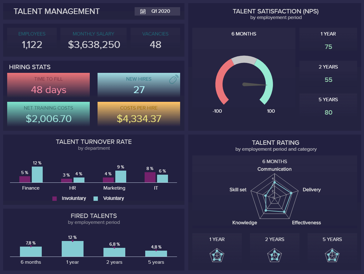
17. HR Performance Management Dashboard
Human resources is becoming increasingly analytical, and modern software solutions are offering a robust, reliable, and accessible means of managing your internal talent across departments. Your employees are the beating heart of your organization, and as such, offering superior management and leadership is essential. Enter our talent management tool.
**click to enlarge**
A modern business performance dashboard focused specifically on internal talent management, this accessible tool helps HR professionals uncover emerging issues while offering insights on how to find actionable solutions that ultimately benefit the company.
Here, you can track talent satisfaction trends over set timeframes while evaluating your employees’ attributes with an interactive talent rating metric. It’s also possible to drill down into dismissal and turnover rates to measure your staff motivation, engagement, and retention efforts.
Armed with the potential mix of info and HR KPIs, you can take measures to provide the right level of support or training, develop employee retention activities, and gather the intelligence necessary to optimize your recruitment and onboarding processes.
Primary metrics:
- Talent Satisfaction
- Talent Rating
- Talent Turnover Rate
- Dismissal Rate
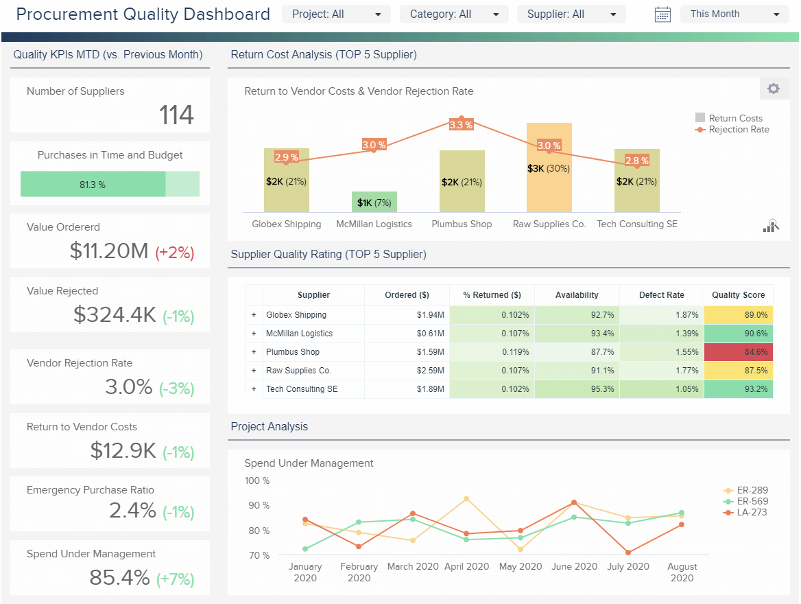
18. Supplier Performance Dashboard
Your procurement strategy is essential to your company’s overall operational efficiency. By keeping every cog in the wheel well-oiled and working with high-quality suppliers, you will see commercial growth and progress.
**click to enlarge**
A procurement dashboard is designed to optimize every core stage of the procurement process. This intuitive software tool measures supplier quality with pinpoint precision. By working with this invaluable project performance dashboard, you can also keep tabs on your supplier numbers, analyze fluctuation in vendor costs, monitor your emergency purchase ratio, and manage your budgets with complete confidence.
Each metric works in unison to help pressured procurement managers nip any emerging issues in the bud swiftly. This slick tool also aids accurate decision-making to improve process flows in a way that boosts the company’s overall output as well as financial efficiency.
Not only is this tool designed to make the procurement management and optimization process quicker, but it also serves up a wealth of deep-dive info insights that will make your procurement decisions significantly more logical and cost-efficient. In turn, you will improve the financial health of your organization, accelerate growth, and improve your brand reputation – three key ingredients of success.
Primary metrics:
- Supplier Quality Rating
- Vendor Rejection Rate & Costs
- Emergency Purchase Ratio
- Purchases In Time & Budget
- Spend Under Management
19. Google Ads Performance Dashboard
When it comes to squeezing maximum value from your consumer-centric data, understanding user behavior better, and delivering top-performing paid advertising campaigns, Google Adwords is one of the best tools around.

**click to enlarge**
But if you want to amplify your GA results, value, and intelligence, working with a Google Ads dashboard is the way forward. Our cutting-edge GA analytics monitoring tool is designed to break down device usage with intuitive at-a-glance visualizations. With metrics that also drill down into conversion rates, costs per conversion, and budget attainment, you have all of the info you need to allocate marketing resources and optimize your messaging for the right channels.
One of the most striking features of this GA-boosting tool is the fact that you can view your top-performing campaigns in an instant, accessing the intelligence you need to optimize all future paid and organic marketing initiatives for the best possible return on investment (ROI).
Primary metrics:
- Conversion Rate
- Cost per Conversion
- Budget Attainment
20. Social Media Performance Dashboard
With 3.96 billion active social media users worldwide, companies across every niche or sector imaginable stand to experience significant commercial growth by leveraging the likes of Instagram, Facebook, LinkedIn, and Twitter.
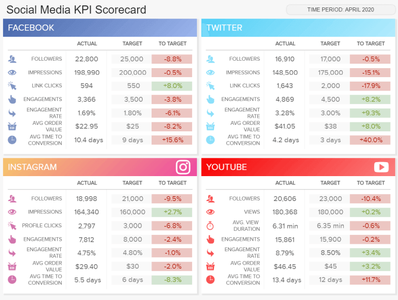
**click to enlarge**
Our social media performance dashboard is visually captivating and splits each platform’s insights into neat segments for swift and confident decision-making.
This savvy social media management tool serves up every key metric you need to gain a deeper understanding of your content across platforms. By drilling down into targets like follower numbers, views, engagement, conversions, view durations, and average order values, it’s possible to discover what resonates most with your audience.
Much like a content performance dashboard, this powerful analytics tool will give you a clear insight into the best times to post content as well as the response your messaging receives. By doing so, you can create multi-channel social media campaigns that boost brand awareness, spark commercial growth, and earn a maximum return on investment (ROI).
Primary metrics:
- Average Order Value
- Average Time to Conversion
- Engagement Rate
Try our professional dashboard software for 14 days, completely free!
How Do I Make a Performance Dashboard?
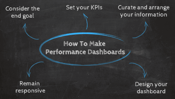
We’ve answered the question, ‘What is a performance dashboard’, and explored a mix of real-world examples. Now, it’s time to look at how to create a simple dashboard to measure performance, whether you need a TV dashboard for an office display or you want to present them on your desktop computer.
- Consider the end goal: Before you begin to build or design your business performance dashboard, understanding your core or end goal is essential. A business development dashboard typically assists with the decision-making process while uncovering potential trends or issues, so it’s important to first figure out what kind of data you need to analyze. Sit down in a collaborative environment with trusted colleagues and decide what you want your analytics and data visualization tools to help you achieve. This is an important part of the process and should not be overlooked.
- Curate and arrange your information: Now that you understand the primary purpose of your business performance management dashboard, you can start curating the data you will need to track, monitor, and visualize essential trends and insights. For instance, if you’re a retailer and want to know why people are returning your products or goods, you need to ensure that returns or refunds data and metrics are included as a central part of your dashboard. At this stage, you are beginning to paint a visual picture to work with.
- Set your key performance indicators: Once you know what your main aim is, and you’ve curated the types of data you will need to make your template a success, you can bring your insights to life by setting the right KPIs. Modern performance dashboard templates are equipped with a host of dynamic and interactive visual KPIs that make it easy to extract vital information from a variety of sources at a single glance. Explore our range of interactive KPIs for inspiration.
- Design your dashboard: Whether you’re creating a product performance dashboard, an employee or a team performance dashboard, or anything in between, getting your design elements in place is essential. Without a cohesive design aligned with your specific needs and preferences, your visuals will be confusing and inefficient. The good news is that modern data dashboards are fully customizable (without the need to be an IT professional) and 100% interactive. We’ve put together a dashboard design best practices tutorial to guide your efforts.
- Remain responsive: While modern data dashboards are dynamic and interactive, it’s essential that you remain responsive when creating them. In the age of information, the goalposts are always changing. As such, if you want to ensure your analytics tool continues to present the information you need to remain responsive, committing to constant improvement is vital. By testing your dashboards regularly to ensure they are still relevant and optimized for superior performance, you will continue to grow with the ever-evolving landscape around you. When you produce a performance report, you need to do so with the understanding that, to some degree, you will need to keep tweaking or rewriting it. Keep this in mind, and you will push yourself ahead of the competition.
These points will help you to transform business performance management dashboard solutions from an idea into a tangible, success-driving reality.
“Visualizations act as a campfire around which we gather to tell stories.”—Al Shalloway
Performance Dashboards Mistakes to Avoid
Now that you’ve explored our dynamic selection of performance dashboard examples and how to create one, let’s look at what to avoid when creating one for your organization.
By knowing what not to do when developing a performance management dashboard for your company, you will ensure every metric or insight offers maximum brand-boosting value across the board.
Four mistakes to avoid:
- Trying to make all of your performance dashboard templates or reports 100% universal. When creating any analytics tool (particularly platforms designed to monitor progress), you should tailor them for specific departments or users. For example, you can create separate dashboards for supplier performance, site or, marketing performance, and so on.
- Making your performance KPI dashboard too confusing or cluttered. When in creation mode, you should always choose substance over style. That said, your designs should be clean, minimal, and easy to navigate. Any visual or piece of functionality that makes your reporting tool difficult to use needs to be replaced immediately.
- Failing to periodically review your core data sources. Whether you’re talking about an agent performance dashboard, a social media analytics tool, a sales performance dashboard, or any other kind of platform, it’s vital that you check in with your core info sources. The digital world is in a state of constant flux, so it’s important to ensure your insights are relevant and valuable. If they’re not, your analytics efforts will become redundant.
- Presenting your insights or metrics without context. To ensure that your insights offer maximum value to every user, telling a cohesive story with your visualizations is critical. For inspiration, explore these real-world data storytelling examples.
“If you don’t know where you are going, you’ll end up someplace else”—Yogi Berra
Try our professional dashboard software for 14 days, completely free!
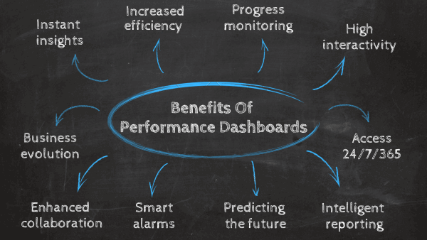
Key Benefits of Performance Dashboards
We’ve considered the question, what are performance tracking dashboards, looked at how to build a dashboard and explored a series of real-world examples. Now, it’s time to dive into the undeniable benefits of using these kinds of intuitive, interactive analysis tools and platforms.
1. Instant insights
Rather than having to wait days, weeks, or months for data reports, modern dashboards offer access to critical data-driven insights almost instantly. Moreover, a dashboard of this kind also provides a panoramic view of real-time information, allowing key stakeholders within the business to make swift decisions that will ultimately save time and money. Your analytics tool doesn’t need to freeze in time. You have the possibility to look at the data immediately, set refresh intervals, and let the software do the arduous work.
2. Increased efficiency
By gaining access to detailed sets of visually digestible information from one central location, you’ll be able to make more informed decisions on a regular basis. Over time, this will result in an overall improvement in your business’s efficiency in the areas that matter most. Everyone in your team or important stakeholders can explore data on their own without the need to copy or send numerous files. You access only one location where you look for insights, reports, analysis, and monitor your performance. That way, the whole company can benefit from increased productivity
3. Progress monitoring
By setting KPIs that align with your business’s goals, aims, and aspirations, you’ll be able to evaluate your progress accurately and understand whether you’re meeting important milestones. And if you’re not, your dashboard will offer a wealth of insight into ways to make improvements that will help you do so. Choosing the right KPI is a different topic but you need to keep in mind to focus on a few that will drive actions toward improving your performance.
4. Interactivity
How many spreadsheets have you scrolled upon and lost hours of work in searching for the right information? With the help of business intelligence dashboards, you won’t need any manual work except utilizing numerous interactive features within your screen; from drill-downs to dynamic text boxes and images – no operational question will remain unanswered. You can easily filter your creation with just a few clicks and immediately find the information you were looking for, without scrolling or manually calculating your data.
5. Access 24/7/365
The online nature of company analytics tools enables you to have access to your data no matter the place or time, you just need Internet connectivity and you can log in to your account from a mobile device, desktop, or laptop. The development of cloud technology provides you with a secure data storage area where you don’t need special IT knowledge, the vendor takes care of updating and managing the software. Your IT department can focus on other important tasks while your data management and monitoring can be done by everyone in the company, no matter where they’re located.
6. Intelligent reporting
You need to report on your performance, no matter the industry or department you’re a part of. A business development dashboard ensures your reporting is on schedule each week, month, or any time interval you set while the data updates itself and you don’t need to think about writing numerous Word files, Excel sheets, or creating a PowerPoint presentation. You can share the report internally or externally, set groups of recipients, or give viewing rights to specific users. The automation will do the rest. You can explore numerous business report examples that can show you how to develop and set up a proper report structure.
7. Predicting the future
When you need to secure beneficial and positive outcomes for your business, a business performance management dashboard will obtain advanced features such as predictive analytics. Oftentimes, statistical analysis is done manually and takes a lot of company hours to complete and provide recommendations for the future. But what if you have the possibility to let the software do the calculations based on your inserted data points and utilize the forecast engine that will visualize your results for the next time period? It seems like a question from the future but today that’s more than possible.
8. Smart alarms
Another benefit you can take full advantage of is the intelligent data alerts feature that dashboards of this kind will have incorporated. With neural network alerts and pattern recognition, you will get automatically notified when an organizational anomaly occurs, keeping your company running at a top-notch level and enabling you to act as soon as possible. That way you can easily focus on other tasks while the company performance dashboard will alert you if something happens software for 14 days, completely free!
9. Enhanced collaboration
A company performance dashboard not only makes organizational insights more digestible but also makes interacting with them more universally accessible. As a result, everyone has the power to benefit from working with analytical tools, which, in turn, prompts cohesive cross-departmental collaboration. When this happens, innovation thrives, pushing organizations further than they ever thought possible.
10. Business evolution
Earlier, we touched on the notion of remaining responsive in an ever-changing commercial landscape. Now, based on the very definition of a dashboard to track performance, it’s clear that in order to drive continual success, you need the kind of tool that can change and scale with you. Perhaps one of the biggest benefits of these kinds of data dashboards is the fact that they will give you the insights, visualizations, and robust, customizable data analyst tools to move with the landscape around you, securing long-term success. And if you want to thrive in business, you have to be able to secure long-term growth. Utilize the right data and the right tools, and you’ll be able to do just that.
“Information is the oil of the 21st century, and analytics is the combustion engine.” – Peter Sondergaard, Senior Vice President, Gartner Research
The Link Between Data and Business Performance
In the Age of Information, there is an undeniable link between online data analysis and organizational performance. By leveraging the insights, information, and metrics that are most valuable to your business, both internal and external, while understanding how to take meaningful actions from the data before you, it’s possible to ensure your business remains robust, resilient, and competitive.
All areas of your modern-day business – from supply chain success to improved reporting processes and communications, interdepartmental collaboration, and general organization innovation – can benefit significantly from the use of analytics, structured into a live dashboard that can improve your data management efforts. According to Accenture, 89% of industry innovators believe that big data analytics will revolutionize business operations in the same way as the World Wide Web. Moreover, 57% of enterprise organizations currently employ a chief data officer, another study conducted by MicroStrategy. If you need more information about the topic, you can learn more from our article that focuses on enterprise software.
You need to monitor your business performance and derive actionable insights. If you fail to do so, you risk damages to your productivity and costs. With the competitive market that your company faces, that can only bring danger to shut down your operations. That kind of gamble is not the path to success. You need data-driven decisions, and a dashboard for business performance will make sure you reap the best possible rewards.
It’s clear that big data, if used to its full potential, has the power to improve your organization’s operations and initiatives exponentially, and a performance tracking dashboard is pivotal to squeezing every last drop of value from the data before you.
A performance-based dashboard provides unrivaled digital wisdom. When you use data in a way that makes sense in a real-world context (rather than just in theory), you will be able to drive change and make genuine improvements to your business. And that is the key concept of business-based performance dashboards.
Try our professional dashboard software for 14 days, completely free!
Key Takeaways Performance Dashboards
We’ve asked the question, “What are performance dashboards?” and explored a mix of real-world examples. One thing’s for sure: whether it’s a dashboard for an SQL server or a performance report for customer service when it comes to performance analytics, the possibilities are almost endless. You can utilize performance metrics in healthcare, retail, eCommerce, research, SaaS, energy & utilities, telecoms – the list goes on. The bottom line is, performance-style dashboards and metrics will make your business better.
From a hospital performance dashboard to a sales performance dashboard, employee performance dashboard, and beyond, these highly visual reporting tools will uncover trends, patterns, and brand-boosting insights that usually get missed.
Data offers the level of vision needed to make your company more robust, agile, and efficient. To drive this key message home: business analytics tools provide the brain and eyes that will ultimately allow you to process, analyze, and extract the value of that data for continual innovation and growth in a fast-paced world.
We have seen in our examples of modern dashboards, created with self-service analytics tools, just how powerful benchmarking your data with efficiency can be. These dashboards will empower you to present your data in a truly accessible, digestible format that is easy to follow while uncovering insights that will transform your business into a cohesive, communicative, innovative, adaptable, and robust commercial machine.
Embrace the power of BI dashboards today, and you’ll reap endless rewards tomorrow. For more details on working with dynamic performance templates and using business intelligence the right way, try our cutting-edge analytics software with a free 14-day trial. Your path to consistent commercial success is just a click away.