
BUSINESS INSIGHTS AT YOUR FINGERTIPS
OUR RICH USER EXPERIENCE EMPOWERS ANY USER TO REVEAL THE INSIGHTS BEHIND THEIR DATA
datapine's self-service analytics tools allow users of every skill set to explore their data and generate meaningful insights within minutes, so that everyone in the company can take advantage of data-driven decisions. Data experts will find an advanced feature set to dig deep into all kinds of information.
Our intuitive drag and drop interface is the perfect way for any member of your team to visualize data. Whereas other BI tools require the involvement of an IT department to access analytics, with datapine any member of your team now can generate and beautifully visualize insights from your data. With our self-service analytics tool, we empower any user to build professional charts, tables as well as a professional business dashboard and start displaying meaningful information right away.
With datapine, even the most inexperienced user can explore data and create rich reports. This means you will not have to rely on other departments or time-consuming processes to obtain the information you require. Create a wide array of data visualizations, from geographical maps to line charts to waterfall charts, use conditional formatting to point out unexpected values or discover hidden patterns and trends. Key Performance Indicators (KPIs) will come to life before your eyes and it will be easier than any spreadsheet you have built so far.
Ad hoc
queries
Drag &
Drop UI
Powerful
filters
full tablet
support
Try our easy-to-use yet powerful business intelligence software 14 days for free!
PERFORM ADVANCED CALCULATIONS WITH EASE
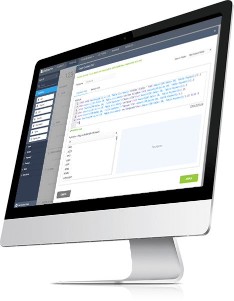
CLEAN AND MANIPULATE YOUR DATA BY UTILIZING CUSTOM CALCULATIONS
You probably have experienced immense growth in data that you need to manage, control, and alter to correspond with your specific business and analytics needs. Excel is not enough for you and you need advanced data manipulation possibilities that will enable you to clean and manipulate your data before creating KPIs. Our self-service analytics software removes these static traditional blockers and allows you to work with data sets of every size and format.
To calculate the most complex business metrics, you need advanced options such as custom calculations and expressions. Creating custom columns and utilizing familiar Excel expressions enable you to manipulate your data with even more precision and modification possibilities that will, ultimately, advance your analysis and create an effective data manipulation environment. By cleaning your data with existing expressions or creating customized with our drag and drop, you will be able to build formulas for any possible data analysis scenario.
With over 80 predefined functions in our expression library such as SUMIF, NPS, CASE, or IIF, among others, you will have the chance to simply drag the function you want to use, and edit in a way that fits your analysis goal. But not only, as you can easily switch between a calculated and merged field, where you can select the join types and merge multiple dimensions into one. From basic equations to complex formulas, you have our expression library at your disposal. datapine provides you an intuitive way to combine different data sets and set up all calculations you need.
Perform advanced
Calculations
create Custom
Columns
use familiar excel
expressions
modify text and
date fields
EASY-TO-USE & POWERFUL ANALYTICS FEATURES
USE ADVANCED FEATURES TO SIMPLIFY YOUR ANALYTICAL PROCESSES
In business, you need to be able to create future strategies that bring growth, quickly analyze your data, and generate actionable insights. As time is oftentimes scarce, and you and your team have different skillsets, you need a self-service business intelligence software that will adjust to your working environment and give you features that will save time, increase productivity and, ultimately, bring sustainable development.
That’s why we have developed special analytics addons that accommodate the self-service analysis for the whole team, no matter the skill level. Everyone wants to know what will happen in the business future, drill into multiple levels of the analysis, and utilize conditional formatting for different analytical needs.
Our self-service analytics tools such as predictive analytics will enable you to optimize your future business performance. Conditional formatting will ease your data organization efforts while drilldowns will benefit your analysis since you will enjoy a high level of interactivity. Comparisons with previous periods will quickly show how you performed against a specific time period and create a more productive analysis process. Finally, modern data alerts that are built on AI-based and machine learning capabilities will ensure no important metric stays out of your business radar.
| platform component | platform feature | description & benefits |
|---|---|---|
|
Analyzer
|
Drag & Drop Interface
|
Easily build charts & tables in an intuitive drag & drop user interface within seconds.
|
|
Analyzer
|
Ad-hoc Queries
|
Take advantage of ad-hoc queries & analysis to answer urgent business questions immediately.
|
|
Analyzer
|
Self-Service Analytics
|
Benefit from a wealth of self-service analytics features, that can be used without profound BI experience.
|
|
Analyzer
|
25+ Different Chart Types
|
Choose from over 25 modern chart types from stacked charts to maps to waterfall charts.
|
|
Analyzer
|
Calculated Fields
|
Clean and manipulate existing fields or create custom fields by drag & drop, based on individual formulas.
|
|
Analyzer
|
Expressions Library
|
Take advantage of over 80 predefined functions such as SUMIF, NPS, CONCAT or IIF.
|
|
Analyzer
|
Merged Fields
|
Merge different dimension fields with different join types (cross, left, right, inner join).
|
|
Analyzer
|
Cross-Database Queries
|
By setting up merged fields you have the possibility to make cross-data source queries in datapine.
|
|
Analyzer
|
SQL Mode
|
Build dynamic charts writing manual queries or using existing statements in any common database dialect.
|
|
Analyzer
|
Auto Query
|
By default datapine instantly visualizes your drag & drop actions. If needed, you can turn off this option.
|
|
Analyzer
|
Duplication Wizard
|
Prevent row duplication when querying fields with one-to-many relationships with the duplication wizard.
|
|
Analyzer
|
Aggregation Types
|
Use different aggregation types, such as SUM, COUNT, AVERAGE, DIST. Count, MIN, MAX, MEDIAN or VARIANCE.
|
|
Analyzer
|
Split Result Set
|
Decompose your results according to certain criteria, splitting up your result set into different segments.
|
|
Analyzer
|
Running Total
|
You can use the accumulate over time function for charts to calculate the running total of any number.
|
|
Analyzer
|
Null Values
|
You have multiple options to include or exclude NULL values in your analysis for text, date or numeric fields.
|
|
Analyzer
|
Filters
|
Easily apply custom filter values to your data visualizations and exclude selected values, if needed.
|
|
Analyzer
|
Filter Raw Data |
Filter the underlying raw data with a few clicks using different operators: =, !=, <, >, is NULL, not NULL etc.
|
|
Analyzer
|
Limit Result Set (Threshold)
|
Sometimes it is necessary to limit the result set to get the right insights. A wealth of operators are available.
|
|
Analyzer
|
Group Results
|
Define custom groups to aggregate several values from one field into one group (e.g. DE, AT & CH = DACH).
|
|
Analyzer
|
Time Values
|
Modify time values of charts by different breakdowns and static or dynamic observation periods.
|
|
Analyzer
|
Custom Time Periods
|
Define custom time periods using the multiple periods option to set date fields that cover your needs.
|
|
Analyzer
|
Downsampling
|
This function enables you to show a selected amount of data points. It's useful for very large data sets.
|
|
Analyzer
|
Merge Chart Types
|
When creating charts with several measures, it's useful to apply different chart types to show dependencies.
|
|
Analyzer
|
Conditional Formatting
|
Define rules to apply selected colors based on fixed, relative or custom criteria to your charts and tables.
|
|
Analyzer
|
Comparison Period
|
Compare data series to different past timeframes such as the previous period or same period previous year.
|
|
Analyzer
|
Sorting Results
|
Change the default sortation of the measured values to a custom order to get the visual illustration you need.
|
|
Analyzer
|
Chart Value Options
|
Easily show or hide single chart values with a few clicks. The referring chart legend will adjust.
|
|
Analyzer
|
Tooltips
|
Add additional information to your charts with custom tooltips (single value, multi-value or custom text).
|
|
Analyzer
|
Data Labels
|
Show or hide data labels and adjust their position and visual appearance to your individual needs.
|
|
Analyzer
|
Chart Legend
|
Adjust the position of the legend (left, right, bottom, top) as well as the font size and colors.
|
|
Analyzer
|
Chart Colors
|
Customize the chart background with different colors and choose from different gradients and grid colors.
|
|
Analyzer
|
Axis Title
|
Easily adjust your axis titles with custom text and various styling options and optional allow text wraps.
|
|
Analyzer
|
Axis Scale
|
You can edit your axis scale with selected minimum and maximum values or a specific interval.
|
|
Analyzer
|
Number Formats
|
Change the number formats including decimals, symbols, formats and units to your individual needs.
|
|
Analyzer
|
Data Series Options
|
Adjust data series types (line, area, stream, column, bar, scatter), colors and data series lines and marker.
|
|
Analyzer
|
Secondary Axis
|
Add a secondary axis to your chart to visualize two variables in the most meaningful way possible.
|
|
Analyzer
|
Advanced Table Options
|
Choose from extensive table color, layout, number format and background options for your tables.
|
|
Analyzer
|
Drilldown Options
|
Add interactivity to your charts by using drilldowns to easily drill into a lower level of the X-axis.
|
|
Analyzer
|
Trend Indicators
|
Choose from a variety of trendlines such as power, exponential, linear, logarithmic, polynomial or best fit.
|
|
Analyzer
|
KPI Creation
|
Build custom Key Performance Indicators (KPIs) with a few clicks and get inspired by 250+ examples.
|
|
Analyzer
|
Alerts
|
This allows you to set up automated alerts based on thresholds, neuronal networks or pattern recognition.
|
|
Analyzer
|
Predictive Analytics / Forecasting
|
Use our built-in predictive analytics to predict future outcomes, without in-depth data analysis skills.
|
|
Analyzer
|
Exporting Options
|
Easily export your charts in different file formats, including XLS, PDF, PNG & CSV.
|
Drilldowns
Predictions
Alarms
Conditional Formatting
YOU FEEL FAMILIAR WITH SQL? SO DO WE!
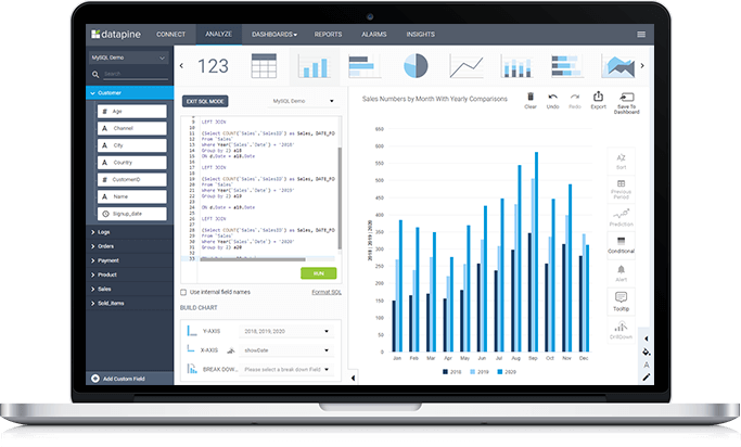
GO BEYOND OUR DRAG AND DROP INTERFACE AND BUILD YOUR OWN SQL QUERIES WITHOUT RESTRICTIONS
Reconcile our user-friendly tool with your SQL knowledge. If you have strong SQL skills, you will like datapine even better, since our unrestricted SQL mode allows you to use any code you already have in place. Furthermore, as the only solution in the market, we enable you to use the query result to perform further calculations - such as pivot tables - that would not be possible with plain SQL.
Our self-service analytics tool works in the native language of your data source. We support anything from MySQL, Oracle, PostgreSQL, SQL Server to AWS, and many more. You won’t be limited by separate sources but are able to run cross-database queries and merge your results on-the-fly.
run custom
sql queries
build sql query by
drag & drop
blend disparate
date
all common
dialects supported
Try our easy-to-use yet powerful self-service analytics software 14 days for free!

"Importing CRM data dump allowed us to quickly visualize and segment our data for analysis."

"datapine's solution did not disappoint us: we had some serious challenges with very complex data sets and their team really helped us out."

"datapine allows access to visualized realtime data to us and our customers – hence we can spend our time implementing the results."

"We were amazed how easy it was to use datapine and get the first KPIs within a couple of minutes."

"datapine makes it easy and fun to do reporting, presenting complex data into beautiful dashboards."

"We use a white labeled version of datapine to better visualize the data that our hygiene management system captures. This data enables our clients to ensure their facilities are always clean and hygienic."

"With its unique combination of scalability, ease-of-use and functionality, datapine changed the way we analyze our data."

"Thanks to datapine we are able to review all relevant customer data and react on trends and opportunities much faster."

"The combination of a supportive team and a powerful tool make Datapine an amazing solution to monitor the KPIs in our company."